In a continuation of the series on patterns, colors, and textures, I will primarily deal today with color. In this case, the traditional wisdom more or less holds true. You don't want to look like a rainbow, no matter how much you support gay pride (trust me, looking good and dressing well will be more convincing). Most outfits are comprised of one, two, or three colors, though it's not impossible to incorporate more if you know what you're doing. Generally the colors decrease in prevalence the more you add, each one being less represented in the outfit than the last. I'll address each of these possibilities in quick succession.

First, the monochromatic option. It's unusual to see this and it is, honestly, a somewhat fashion forward concept. This is partially because it almost has to be given fashion's history (given what and blue shirts being so popular, and dark suit colors against them). However, it is possible to go all white, all black, all grey, or even all of something else (if you can find items that match - those others are safe because ties, shirts, and suits all exist in all of them readily available). The thing that's important when mixing monochromatic colors is to either stay completely monochromatic (no patterns or almost invisible patterns) or to vary patterns so that you have a variety (such as the photo shown). This is a svelte, put together look, but you have to make sure that you do it in a way that isn't dull or lackluster.

Next, two colors. This is perhaps even easier to set up than the monochromatic scenario, despite having more colors involved. It's fairly easy, and even simply normally advisable, to find a matching shirt and tie (yes, politicians will only wear white shirts or blue shirts underneath a dark suit, but for those of us that want to be a little bit more fashionable and honestly better dressed...). Consider the picture to the left, the man has a shirt, tie, and pocket square all in the same color scheme, and a suit that sets them off beautifully. I will point out at this point that when I make reference to color, it's color relatively close together, they simply have to be acceptably matching shades. I think this look makes a simple, yet elegant outfit that always looks well put together without being too flashy or potentially distracting. It's something to try if you find that your outfits to date have been a bit staid and that that's detracting form the image that you would like to project. This concept is at once fashion forward and classic.

Now, three colors. As I mentioned, there's the typical politician look. This is easily represented by the black suit, white shirt, and candy-red tie worn by Barack Obama in the picture to the left. However, though pictures of the style are scarce, I recommend trying to liven things up and include a different third colored shirt. It's true that this isn't done as often because you don't want to look like you have three completely disjoint pieces on. However, what people fail to realize is that while masked by the fact that the white shirt and dark, solid suit mask it, what politicians do is almost exactly that (though it looks fine). Therefore, the best option is to try to find elements in the pattern (maybe a color represented in the shirt that's also in the tie or the suit, etc.) to tie things together. Another way to do this is to add a fourth or more colors.
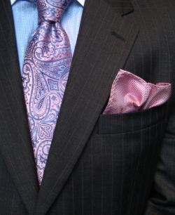
To address the issue of four or more colors, look no further than this paragraph. The photo to the right illustrates an idea of four or more colors. The suit is black, but with a thin white pinstripe that matches the white collar of the shirt (barley visible). The pocket square and the tie both have pink, and there are two different shades of blue (one in the shirt and one in the tie). The shirt even has some white in it other than the color. While listed off like that these things seem very random and jarring, they facilitate two functions. First of all, four colors can be used to tie together an outfit. Though it seems like adding more colors would make the outfit less unified, it can actually add to it. Also, by adding accents that might not be anywhere else in the outfit, you add interest. It merely takes some skill, practice, and knowledge to figure out what is adding interesting accents and tying the outfit together, and what is making it a crazy swirl of color. I'll be back soon with textures!!